Android 17 UI blur is different from Apple Liquid Glass design
Android 17 UI blur is different from Apple Liquid Glass design – Google’s upcoming Android 17 is already generating discussion across the tech world, especially because of its refreshed user interface and new blur effects. As screenshots and early previews continue to circulate online, many users have started comparing Android 17’s visual style to Apple’s “Liquid Glass” aesthetic introduced in recent versions of iOS and macOS. While both platforms appear to embrace transparency, layered depth, and frosted-glass visuals, Android 17 is taking a noticeably different path from Apple’s polished and highly reflective design philosophy.
The comparisons are inevitable. Modern smartphone interfaces are increasingly moving toward softer visuals, translucent menus, floating panels, and dynamic lighting effects. But despite the similarities at first glance, Android 17’s blur implementation feels more functional and grounded, while Apple’s Liquid Glass design aims for a premium, almost futuristic appearance that prioritizes visual drama.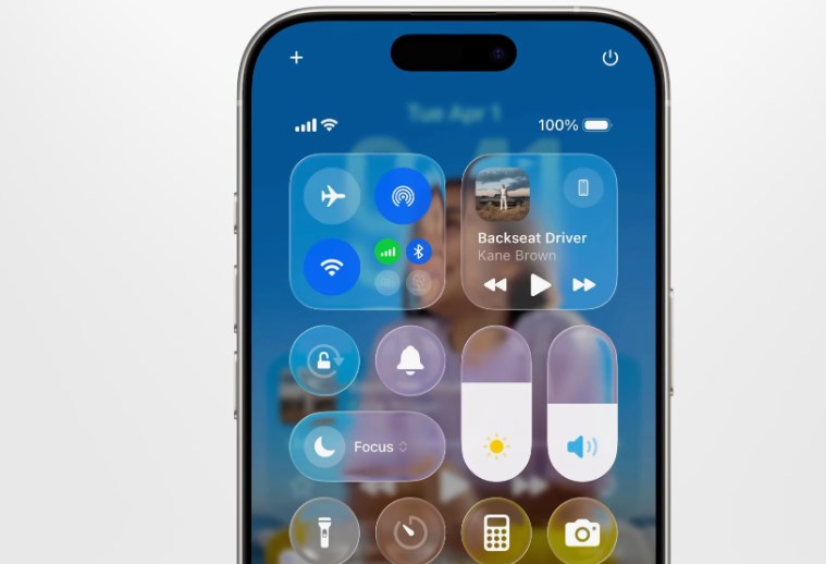
Android 17’s approach represents Google’s ongoing effort to refine Material You rather than replace it entirely. Instead of creating an interface filled with glossy reflections and highly animated surfaces, Google appears focused on making blur effects practical, subtle, and adaptive. This distinction could end up defining the next stage of the Android versus iPhone design rivalry.
One of the biggest differences between Android 17 and Apple’s Liquid Glass design is how the blur behaves across the interface. Apple’s implementation often emphasizes depth through heavy translucency and reflective surfaces. Menus appear to float like sheets of polished glass above the content beneath them. Notifications, widgets, and control panels shimmer with layered lighting effects that react dynamically to movement and background colors.
Android 17, however, uses blur more conservatively. Early previews suggest that Google is applying blur primarily to improve readability and separation between interface layers rather than to create visual spectacle. Backgrounds become softened when users open app drawers, quick settings, or multitasking screens, but the effect remains restrained. The interface still feels unmistakably Android, preserving clarity and usability over decorative effects.
This more measured style may actually benefit Android users in everyday use. Heavy blur and transparency can look impressive during presentations or marketing videos, but excessive visual effects sometimes reduce readability or create distractions during long-term use. Google seems aware of that balance. Android 17’s UI enhancements appear designed to modernize the system without overwhelming users with flashy animations or excessive layering.
Performance is another important reason why Google may be taking a different direction. Android devices exist across a massive range of hardware configurations, from budget smartphones to premium flagship models. Apple controls both hardware and software within a tightly integrated ecosystem, allowing the company to optimize demanding visual effects specifically for its own chips and displays.
Google, meanwhile, has to ensure that Android 17 performs smoothly across devices made by Samsung, Xiaomi, OnePlus, Oppo, Vivo, Motorola, and countless other manufacturers. A restrained blur system is more practical because it reduces the performance burden on lower-end hardware while still delivering a modern appearance. This approach helps Android maintain broader compatibility without sacrificing responsiveness.
Battery life also plays a role in these design decisions. Complex transparency effects, real-time reflections, and layered animations can consume additional processing power and GPU resources. Apple’s premium devices may absorb that impact more easily, but Android manufacturers often prioritize battery efficiency due to varying hardware capabilities and regional market demands. Google’s lighter blur implementation may ultimately prove more efficient in daily use.
Another major distinction lies in customization. Apple’s Liquid Glass design is highly curated and consistent, reflecting the company’s long-standing philosophy of maintaining strict visual uniformity across devices. Users receive a polished experience, but customization remains relatively limited.
Android 17, on the other hand, continues Google’s tradition of personalization through Material You. Blur effects are expected to adapt dynamically to wallpapers, themes, and color palettes chosen by users. Instead of forcing every device into the same visual identity, Android’s system evolves around user preferences. This makes the interface feel more personal and flexible, even if it lacks the ultra-premium sheen of Apple’s design language.
The difference also reflects the broader philosophies of both companies. Apple designs interfaces that feel luxurious and carefully orchestrated, often emphasizing aesthetics as much as functionality. Google traditionally focuses on accessibility, adaptability, and practical interaction. Android 17’s blur effects fit naturally within that mindset. They enhance the interface without becoming the centerpiece of it.
Interestingly, some users have already praised Android 17’s approach for avoiding what they see as “overdesigned” visuals in modern operating systems. In recent years, there has been growing criticism that some interfaces prioritize style over usability. Excessive transparency, oversized animations, and highly reflective elements can sometimes slow down navigation or make interfaces harder to interpret quickly. Android 17 UI blur is different from Apple Liquid Glass design
Google seems determined to avoid that trap. Android 17’s interface still looks modern and refined, but it remains easy to navigate. Menus retain strong contrast, text stays readable, and interactions feel familiar rather than experimental. This balance may appeal to users who want a cleaner experience without dramatic redesigns that require relearning basic navigation patterns.
That said, Apple’s Liquid Glass design undeniably has strong visual appeal. The polished translucency creates a sense of depth and realism that feels premium and immersive. Apple has consistently excelled at making software feel visually cohesive with its hardware, and the Liquid Glass concept reinforces that identity. For many users, the aesthetic alone enhances the feeling of owning a high-end device.
Google’s design, meanwhile, feels more understated and practical. Instead of trying to replicate Apple’s glass-like reflections, Android 17 appears focused on creating smoother transitions and reducing visual clutter. The blur becomes a supporting element rather than the defining characteristic of the operating system.
Developers will also likely notice differences between the two ecosystems. Apple’s tightly controlled interface guidelines encourage apps to adopt the Liquid Glass look consistently across iOS. Android developers typically have greater flexibility, which means Android 17’s blur effects may vary more depending on how app creators implement Material Design principles. This could result in a broader range of visual experiences across Android devices and applications.
The timing of these design changes is significant as well. Smartphone operating systems have matured considerably over the past decade. Radical UI redesigns are now less common because users value familiarity and stability. Instead, companies are refining details like animation smoothness, transparency, and depth to make interfaces feel fresher without completely reinventing them.
Android 17’s blur redesign fits perfectly within that trend. It is not attempting to shock users with dramatic changes. Instead, it subtly modernizes the operating system while preserving Android’s recognizable identity. Apple’s Liquid Glass style follows a similar goal but executes it with far more visual flair. Android 17 UI blur is different from Apple Liquid Glass design
Ultimately, neither approach is objectively better. The preference depends largely on what users value most. Those who appreciate polished aesthetics and immersive visuals may gravitate toward Apple’s Liquid Glass interface. Users who prioritize practicality, customization, and broad device compatibility may prefer Android 17’s softer, more restrained blur system.
What is clear, however, is that smartphone UI design is entering another major refinement phase. Transparency, layered depth, and adaptive visuals are becoming central elements of modern operating systems. Google and Apple are simply interpreting that future differently.
Android 17 demonstrates that Google does not need to imitate Apple directly to remain competitive in interface design. Instead, the company is refining its own visual identity — one built around flexibility, usability, and personalization. While Apple’s Liquid Glass design shines with dramatic elegance, Android 17’s blur effects may ultimately prove more practical for the diverse and expansive Android ecosystem.
As more official previews and beta releases emerge, users will get a clearer understanding of how Android 17 performs in real-world use. But early impressions already suggest one thing: Google is embracing blur effects on its own terms, creating an experience that feels modern without losing the familiar strengths that have long defined Android.Android 17 UI blur is different from Apple Liquid Glass design